

One thing that makes it difficult to evaluate how good a deal stocks are at any given point in time is the measurement systems are constantly changing. Not only are there several different versions of popular valuation metrics, such as the Price/Earnings ratio, what you also find is investors vary over time in what they view as reasonable. In 1980, stock investors were only willing to pay around $7 for every $1 of S&P 500 earnings (a P/E ratio of 7.4). By 1999, that had swelled to $33!
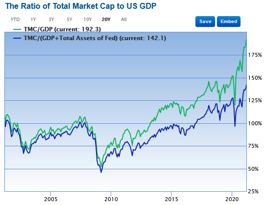
Because of this (and other) issues with metrics such as P/E ratios, investors turn to other metrics to try to gauge if stock prices are reasonable. Another metric that we’ve mentioned several times is often referred to as "The Buffett Indicator" given that famous investor Warren Buffett has longed claimed it as his favorite. It’s simply the ratio of total U.S. stock market cap (the total value of all U.S. stocks) compared to U.S. Gross Domestic Product (the total "earnings" of the U.S. economy).
Click Graph to Enlarge
Long-time SMI members have seen us refer to this before. The version above, courtesy of gurufocus.com, shows that this measure (green line) has never been higher. In fact, when we highlighted this chart just two days before the February 2020 bear market began, it stood at roughly 150. Over the year since, it has exploded to 192!
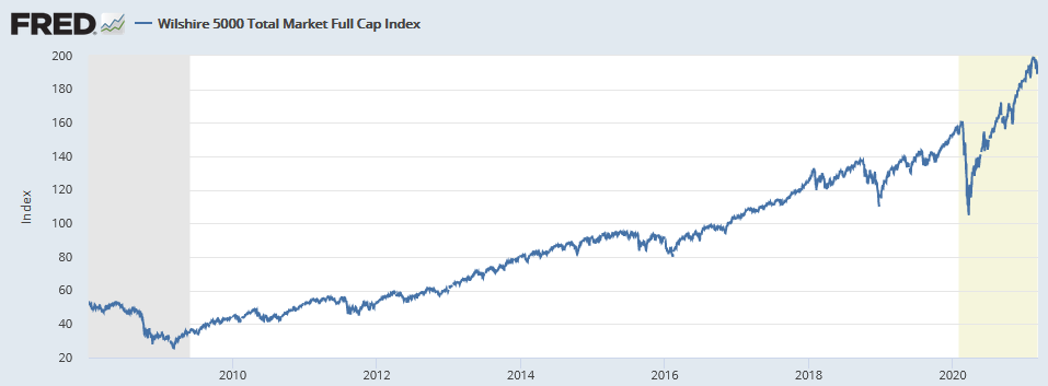
As we look at metrics like these, or at the chart below which shows the roughly 400% gains of the Wilshire 5000 since 2008 (or greater than 600% if measuring from the bottom of the 2009 bear market), it’s hard not to draw the conclusion that the stock market must be way overvalued today.
Click Graph to Enlarge
(Wilshire Associates, Wilshire 5000 Total Market Full Cap Index [WILL5000INDFC], retrieved from FRED, Federal Reserve Bank of St. Louis; https://fred.stlouisfed.org/series/WILL5000INDFC, March 10, 2021.)
There may be another explanation
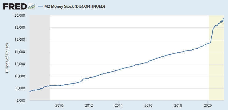
Guess what else has been rising at a rapid rate over the past dozen years? The money supply.
Click Graph to Enlarge
Funny how those two charts look similar if you squint a little.
Admittedly, you can fall down a rabbit hole pretty quickly digging into the various measurements of the money supply (M1 vs. M2 and so on). For our purposes here, it doesn’t really matter what measure of money we use. The point is simply that the amount of money in the system has been expanding rapidly at the same time the stock market has been in an epic 12-year bull market.
Using gold as the denominator
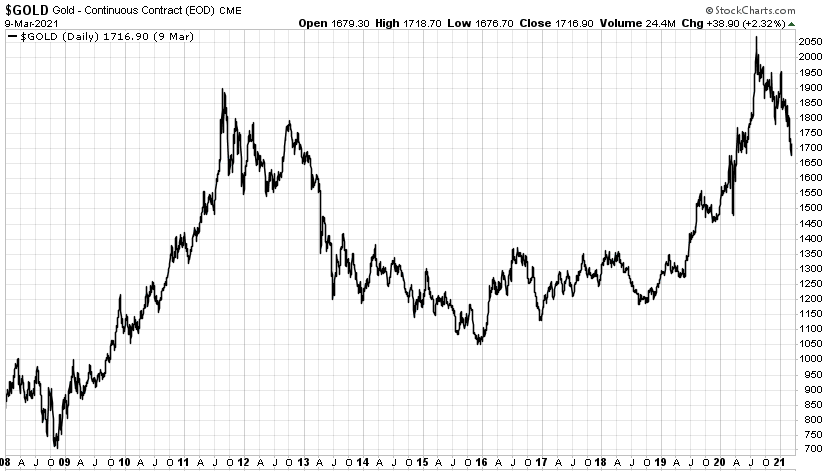
Gold has been used as money and a store of value for millennia. Not surprisingly, it too has swelled in value in recent years, if we’re measuring that value in dollars.
Click Graph to Enlarge
Gold had a massive bear market from 2012-2015, so it’s not quite the straight line up from lower-left to upper-right that we saw with stocks and the money supply. But the overall trend has been similar, with gold priced in dollars increasing from around $800/oz. to over $2,000/oz. last year before pulling back.
So here’s a thought experiment. What if instead of pricing the stock market in dollars, we take the debasing value of the dollar out of the equation by pricing the stock market in gold?
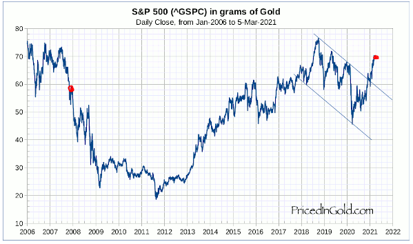
Thankfully, the folks at pricedingold.com have already done this for us. Here’s a recent chart that corresponds to the 2008-2021 charts we’ve been focused on in this post.
Click Graph to Enlarge
I added the red dots to help square up the rough period we’ve been looking at in the other charts. When we get the dollar out of the picture and use gold as the denominator, we see that stocks have advanced in value since 2008, but the advance is more like 25% or so. That’s a far cry from the 400% gain we saw in the first Fed chart of the Wilshire 5000!
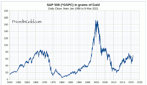
Here’s another view that gives a broader perspective of this metric across the decades.
Click Graph to Enlarge
When we take the declining value of the dollar out of the picture, current stock market valuations look much less dramatic. Just eye-balling this chart, the long-term average of the S&P priced in grams of gold appears to be somewhere around 50. So if stocks are at around 70 grams today, they’re a little overvalued by this measure, but not dramatically so. In fact, adjust this for the recent -20% drop in gold since last August, and that brings that 70-gram valuation down to around 56...very close to the long-term average.
Maybe it’s the denominator that’s broken, not the numerator!
I don’t want this to come across as if we’ve just unlocked some great secret of the universe. None of these measures is perfect. But it can be helpful to look at the big picture from a different perspective. We’re so used to seeing the prices of all financial assets quoted to us in dollars that it becomes like water to a fish — we don’t even think about it.
That "denominator" in every valuation equation is at the heart of the inflation/debasement question every investor is grappling with today. If the falling value of the dollar — and importantly, we’re not talking about falling relative to other currencies, we’re talking about the value of fiat currencies falling relative to real assets — is largely responsible for the rising prices of virtually all financial assets (stocks, bonds, real estate, gold, etc.) since 2008, then why would we expect asset prices to stop rising as long as the debasing of the currency (currencies) continues?
This is admittedly hard to process for those of us who have been investing for many years. We’re used to a fixed denominator that rises very slowly. That allows us to focus on stock prices and evaluate them through a framework of rising and falling prices where the standard of measure isn’t shifting. The past dozen years we’ve seen massive price appreciation in everything, which makes it feel like we’re way overdue for these prices to meaningfully correct lower.
But if the denominator keeps shifting, meaning it takes more and more dollars to buy the same "unit" of economic growth or slice of the S&P 500, then of course those prices are going to continue to increase. And they’re going to do so without really reflecting any fundamental change in value. This means there’s really no need or reason for those prices to correct, because it’s not the value of the real assets that’s changing, it’s just a diluted standard of measurement that’s shifting.
I’m still leery of a potential spring/summer correction, more because of the signs of speculative excess I see everywhere (see here, here, and here) than because of worries over these valuations. I could also be totally wrong and a massive bear market could be lurking! The good news is our process really doesn’t change either way. We’ll keep doing what the SMI strategy signals tell us to do, and our portfolios will get incrementally more conservative (or aggressive) as future trends unfold.
That said, this post helps explain why I don’t have a particularly bearish view about the next few years. It seems the immediate plan is to borrow, print, and spend like we’ve never seen before. That will lead to its own set of problems down the road, but a crashing stock market in the short term may not be among them.
What do you think? Too optimistic? Let’s talk about it in the comments below...