

Now that 2025 is behind us, the chart makers at First Trust Portfolios and J.P. Morgan Asset Management have been busy producing updated graphics that include performance data through the end of last year. These "visual aids" should encourage you to stay the course with your investing plan!
From First Trust's latest Markets in Perspective (PDF), here is an updated version of a classic graph showing the history of bull and bear markets dating back to 1942. As you can see, bulls have lasted significantly longer than bears and have added more value than bears have taken away.
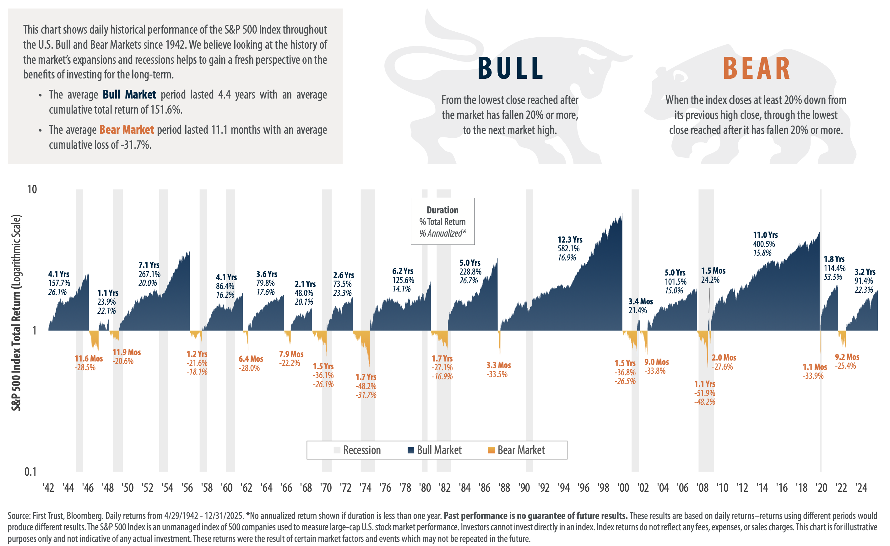
Click to enlarge.
Here's another from First Trust, showing the S&P 500's deepest percentage decline each year (going back to 1980) and also where the index finished each year. You'll notice that at one point in 2025, the S&P 500 was down –19%. However, it ended the year with a +16% gain!
Interestingly, such large bouncebacks (a double-digit "loss" to a double-digit year-end gain) aren't uncommon. They've occurred 13 times since 1980.
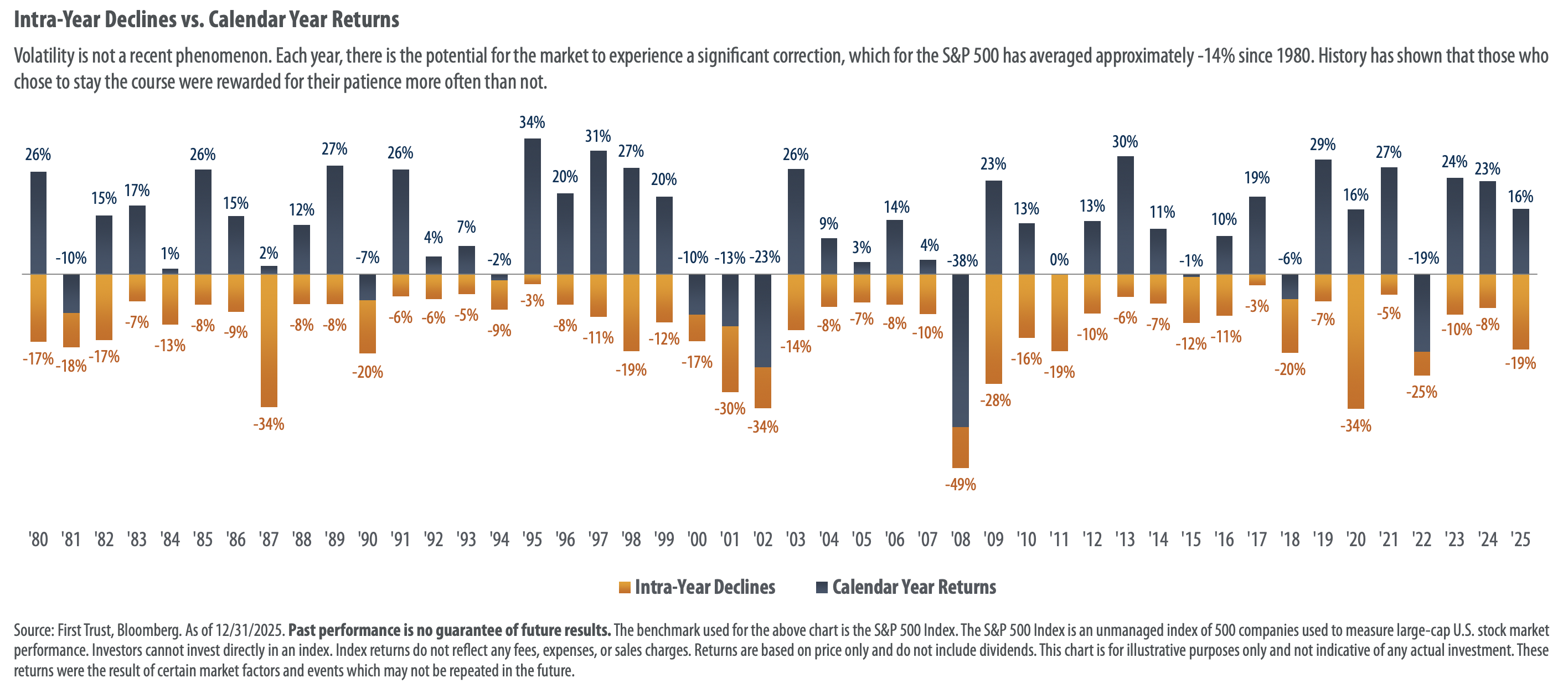
Click to enlarge.
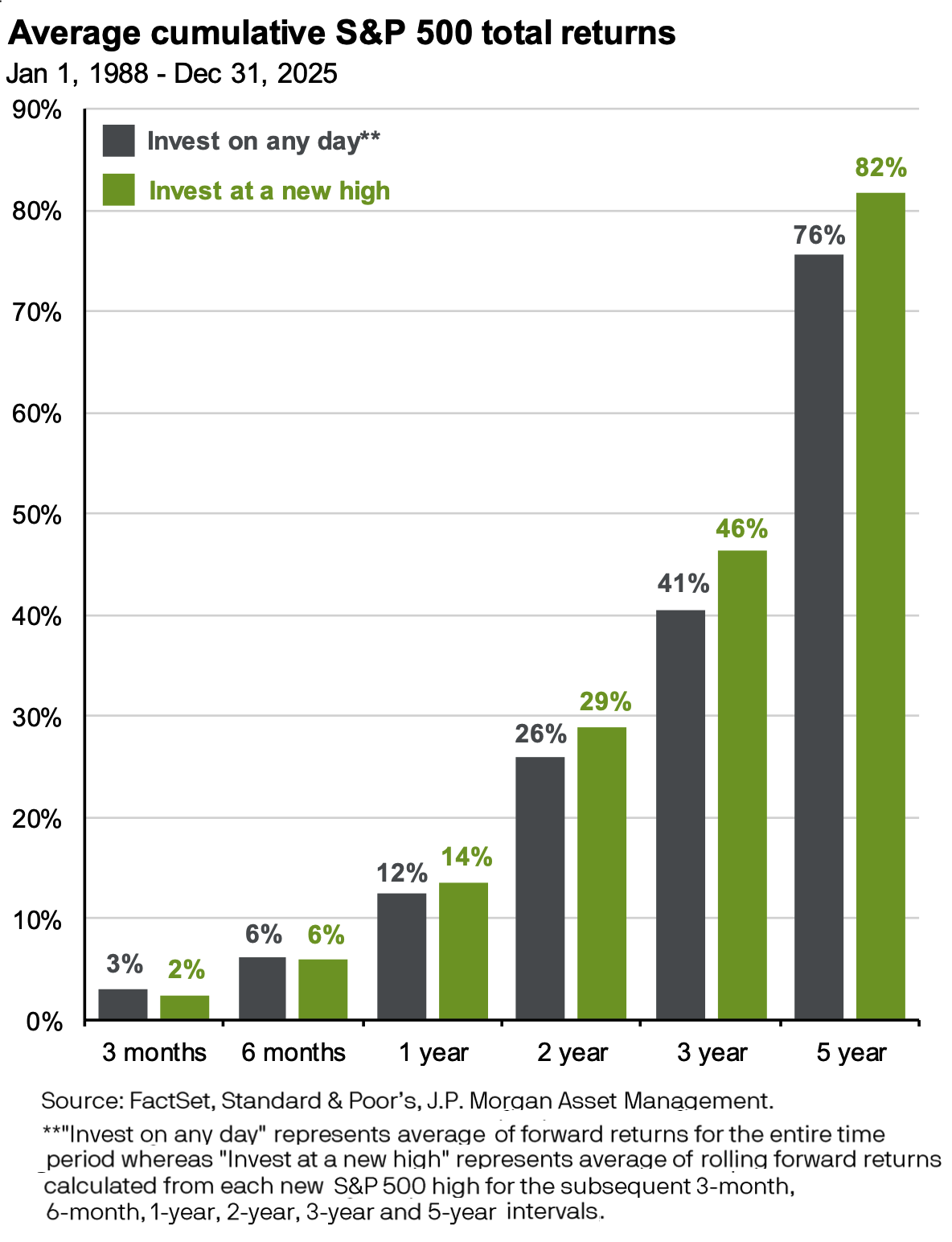
Some investors worry about investing when the market is at new highs, fearing they will suffer losses when it pulls back. This graph, from J.P. Morgan's latest "Guide to the Markets," indicates that long-term investors need not worry.
This next chart, also from J.P. Morgan, illustrates how strongly the "Magnificent 7" stocks have outperformed since 2023. Note, however, that the performance gap between the Mag 7 and the S&P 493 (i.e., the rest of the S&P 500) narrowed considerably in 2025.

Here's an interesting chart showing how tech companies have grown to dominate U.S. market capitalization. Not a single company that was in the Top 10 in market cap 1985 or 1995 is among the biggest companies today! Only one company (Microsoft) that was in the Top 10 in 2005 is still there.
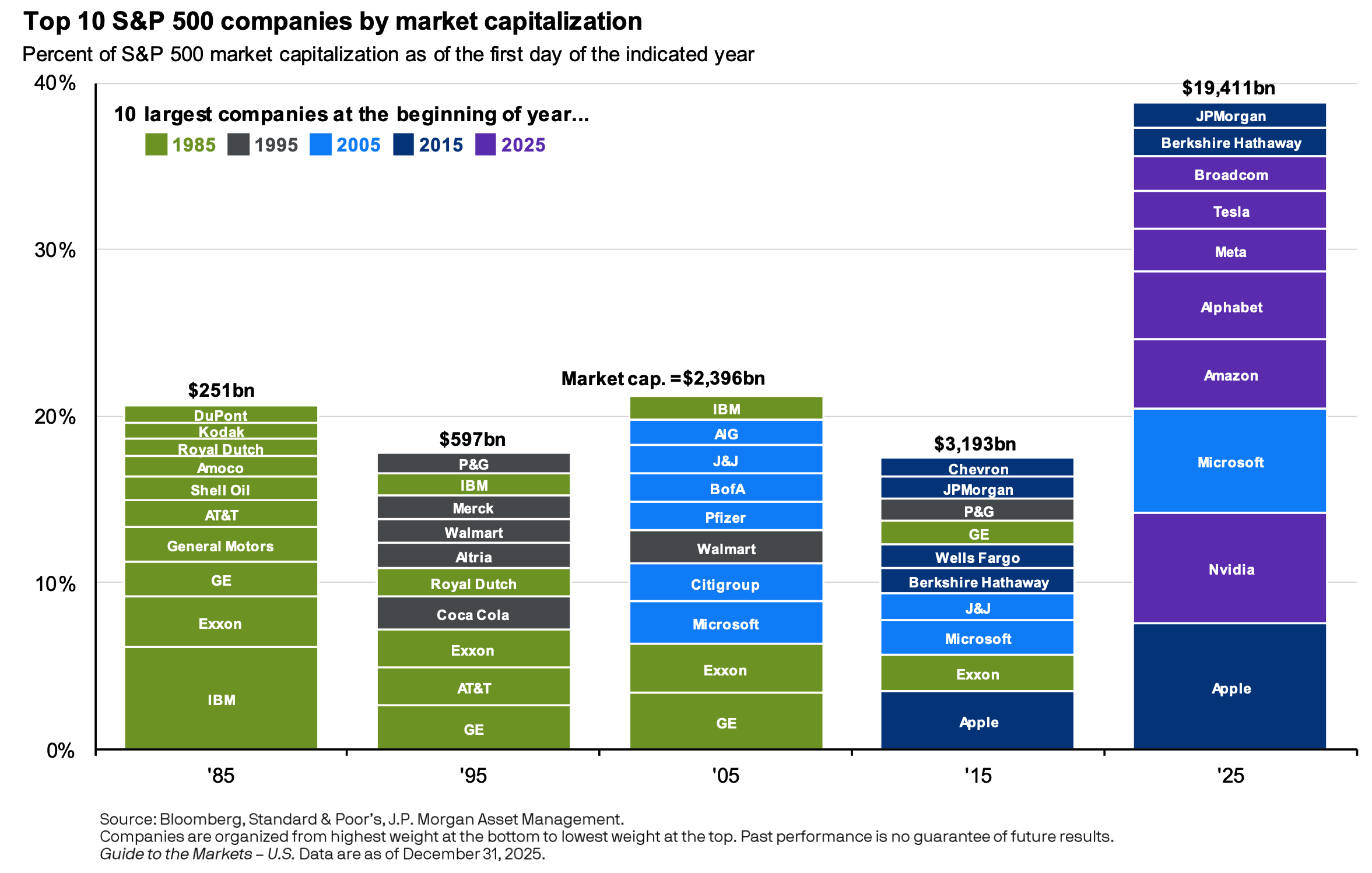
Click to enlarge.
SMI's approach
As the saying goes, a picture is sometimes worth a thousand words. The "pictures" above — the charts and graphs — provide clear visual support for the wisdom of SMI's approach to investing: invest for the long term, don't give in to fear during pullbacks, stay diversified, and follow the momentum signals that can help you remain on the right side of market trends.
No one knows what these various investment charts will look like a year from now when updated through the end of 2026. Some years are good, and some are not. But slow and steady wins the race. Stay the course, and you're likely to come out well ahead.