

While many investors tend to focus primarily (or exclusively) on the stock market, there are important signals that can be gleaned from other markets as well. Even better, combining the points of view of multiple markets can sometimes help illuminate the bigger picture.
With that in mind, let’s take a look at a few of the key markets and what they seem to be saying.
Bonds
Most stock investors don’t realize it, but the size of the global bond market dwarfs that of global equities. Bonds tend to be more strictly governed by mathematical certainties than equities, which have a lot more room for sentiment to drive variation in valuation. The combination of those two factors explain why, when the bond market and stock market appear to disagree on the message they’re communicating, most smart money will tend to believe the bond market over the stock market.
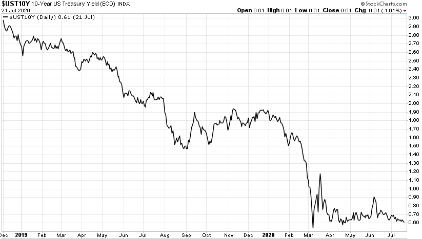
So what is the bond market saying? Consider the following chart of the 10-year Treasury yield:
Click Graph to Enlarge
This chart tells us a couple of things. First, it’s clear from the long downward slope that yields have been falling a lot longer than just the time since COVID came on the scene. Given that Treasury yields are a rough proxy for economic growth expectations, it appears the bond market had been expecting (and receiving) slowing economic growth throughout most of 2019, prior to COVID. The waterfall decline and subsequent trouble in the Treasury market are obvious in February and March of this year.
But contrary to what the rising stock market seems to be saying about an improving economy, there isn’t any sign of that in bond yields. There was a very brief spike in yields in early June that corresponded with the initial re-opening optimism that could have been interpreted that way. But yields have resumed their steady decline since then. This is definitely not an "economic activity is picking up" chart. That’s good for our bond holdings, but bad for the economic recovery story.
Gold
Gold often gets pegged with the reputation of an inflation hedge, largely because of its superb performance during the last period of significant inflation the U.S. had back in the 1970s. That’s probably an oversimplification though, as we’ll see in a moment. I’ve described gold before as "central bank insurance," a relationship that seems to capture the gold dynamic better than inflation alone does. If gold is the "uncertainty" trade, then the perception that the Fed (and other central banks) are increasingly likely to make policy mistakes would make sense as a driver for gold. Said differently, the more active central banks are and the more important their role is perceived to be, the more likely it is that their actions could have negative unanticipated consequences.
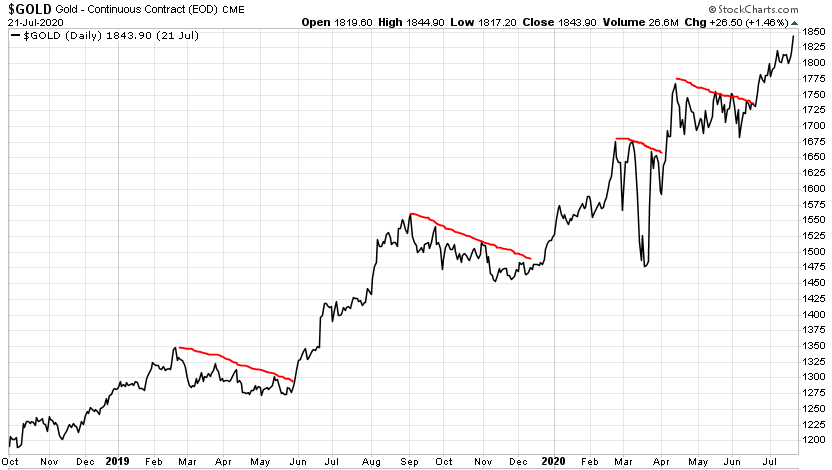
Here’s a chart of gold going back to late 2018:
Click Graph to Enlarge
A couple of things stand out. First, gold has been in a rising pattern for over a year and a half now. COVID and the Fed’s response didn’t begin gold’s rise — they merely perpetuated a trend that was already in motion. This is important to consider in terms of the inflation narrative, because if inflation expectations were the driver behind gold’s rise, why would gold have been rising throughout last year when economic growth was clearly slowing (and falling bond yields confirmed lower inflation expectations)?
To my eye, a better explanation is that starting in late-2018, investors began to grow increasingly wary of policy errors by the Fed. Remember, the Fed was gradually tightening (raising) interest rates through 2017 and 2018. By late 2018, a disconnect developed where the market clearly felt rates were getting too high, yet the Fed kept saying and acting as if the hikes would continue. This culminated in the stock market correction in December 2018 and the much-criticised (by me!) "Powell pivot" on January 4, 2019, where he caved to the markets and abandoned any pretense of normalizing interest rates.
The part of the inflation-driver argument that is clearly accurate is the dollar-debasement aspect of Fed policy and government borrowing. That’s not exactly the same thing as inflation, but it’s close. It’s certainly reasonable to look at the chart above and suggest that increasingly out-of-control borrowing, with the expectation that the Fed might be called upon to debase the currency as a means of lightening that debt load, could have been driving gold’s rise as well. The main point here is simply that while inflation expectations really didn’t take off until the Fed/Gov’t response to COVID in March, gold’s rising trend began much earlier, so it’s hard to square this move as simply a response to growing inflation expectations.
Another thing that’s interesting in this chart is the stair-step nature of it, highlighted by my clumsily drawn red lines. There’s a clear pattern of gold rising for a period of time, usually a few months, punctuated by a consolidation of sideways to slightly declining prices under the red lines. There’s no clear repetition in terms of the size or length of these expansions, but the pattern is why I suggested in the June cover article on Gold that buying the gold-mining stocks on a pullback was a reasonable idea, precisely because these pullbacks have come along fairly regularly.
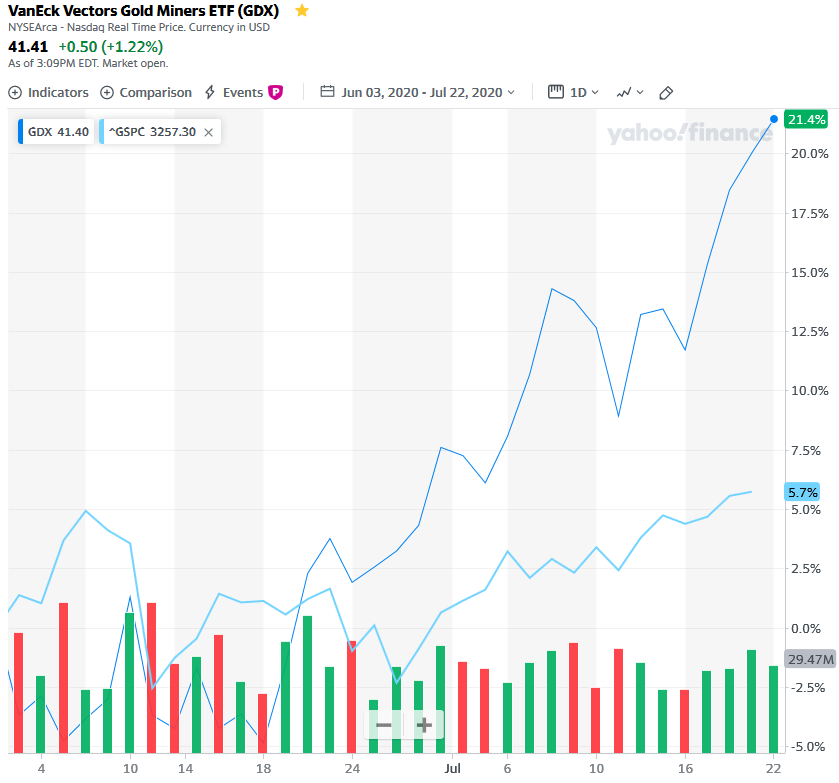
Speaking of the gold-mining stocks, I hope some of you acted on the subsequent update we posted on June 3 suggesting the pullback in GDX (the larger gold mining stocks) to under $33 represented a good entry point for such a purchase. In the seven weeks since then, GDX is up +21.4% vs. +5.7% for the S&P 500. It’s a great illustration of what we mean when we say there are other markets (and other ways to make money) besides the stock market.
Click Graph to Enlarge
Back to the bigger picture message though, the run gold is making at its all-time high price of $1,920 is confirming the signal from the bond chart. Remember, gold is the uncertainty trade — the "things could go really wrong" trade. We wouldn’t expect that to be making new all-time highs against a backdrop of increasingly sunny economic skies. Normally, as the storm clouds dissipate, gold’s price declines (think 2012-2018). So chalk this up as a confirmation of the bond market’s view that the economic outlook remains uncertain, at best.
Stocks
There are so many different charts to choose from to try to convey what’s happening in stocks, but let’s focus on this one to try to keep me on point.
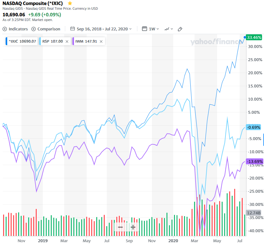
Click Graph to Enlarge
Here’s what this fabulously busy chart is showing us. The top line (dark blue, IXIC) is the Nasdaq index, charted from the September 2018 high through the present. The middle line (light blue, RSP) is the equally-weighted version of the S&P 500, where all 500 stocks get treated equally (unlike the normal S&P 500 index, which is heavily tilted to the performance of the largest components). The bottom line (purple, IWM) is the performance of the Russell 2000 index, which tracks small company stocks.
The big idea to glean from this chart is how dramatically the very largest tech stocks, represented by the Nasdaq index, have run away from the rest of the stock market. While the rest of the S&P 500 index is still slightly below (-0.69%) its level of nearly two years ago, small company stocks — which many view as the most representative picture of the broader economy — are still way below (-13.69%) those highs. Meanwhile, the Nasdaq has increased by +33%!
Overall, the messages from these stock market charts are mixed. On the one hand, tech stocks are at all-time highs. They seem to be saying the sky is the limit. On the other hand, the rest of the stock market clearly isn’t signing off on the "blue skies" theme just yet. Neither the S&P equal weight nor the Russell 2000 small cap index are back to their pre-COVID highs, or even their late-2018 levels.
The economy is not the stock market...
There’s a tendency to look at a series of charts like this and draw a conclusion such as "tech stocks must fall." It’s not that simple. Obviously there is huge monetary and fiscal support behind this market (the EU just agreed on a new $2 trillion package yesterday). Unprecedented actions in that realm mean the range of possible outcomes is exceedingly wide. Floating on a torrent of debased currency and debt, perhaps the long-anticipated inflation does arrive and stocks establish new pricing levels (in less valuable dollars). Or not. The range of outcomes means we have to stay humble, nimble, and not get overly attached to any particular view of how this all will end.
Those who were investing in the late-1990s, when the last tech bubble inflated, may remember Alan Greenspan’s infamous "irrational exuberance" speech, where he warned that stock market prices were getting out of hand. What is easy to forget is that speech happened in December 1996 — the bubble would continue to grow rapidly for over three more years after it was already so widely acknowledged!
The takeaway here is that the markets are definitely not all signaling that the economic picture is improving. Potentially they’re collectively signaling that tech stocks have gotten way ahead of themselves (which doesn’t mean that can’t continue!). Most importantly, the clear message is that there’s plenty of risk left in markets at these levels and with the current economic conditions. So keep a close eye on risk in your portfolio and don’t let the "FOMO" — fear of missing out — cause you to extend outside the system chasing recent returns.