

"A picture is worth a thousand words," the adage goes. That is not universally true, but visual images can communicate quite efficiently and effectively.
The pictures (i.e., graphs and charts) below are from the most recent quarterly "Guide to the Markets" published by J.P. Morgan Asset Management. I found them to be worth many words and I hope you do too.
First, here’s a graph (similar to one we have published before) that illustrates the market’s upward trajectory, with reversals of course, over the past 120 years.

Click Chart to Enlarge
To paraphrase the old watch commercial, "The market may take a licking, but it keeps on ticking."
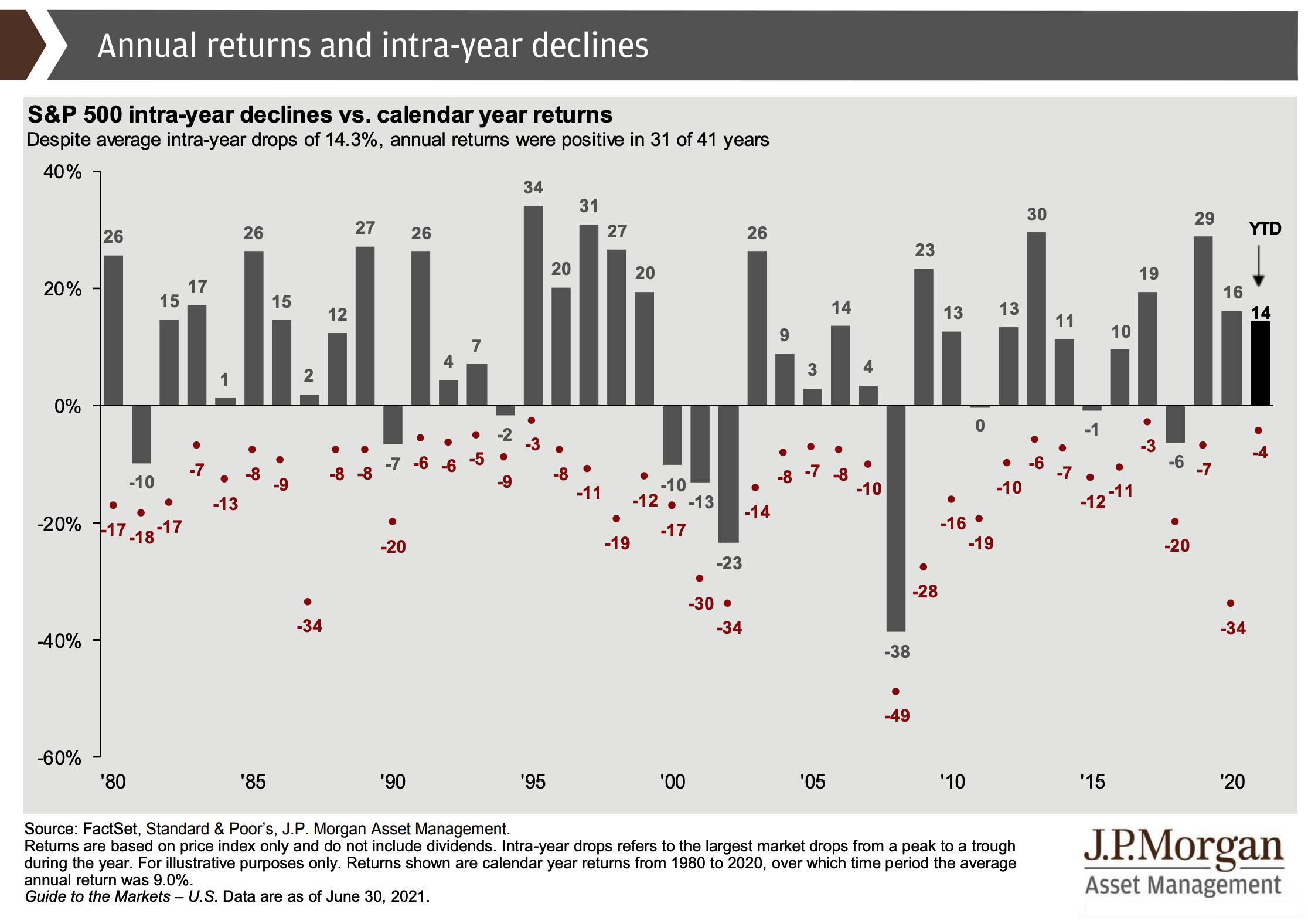
The next chart summarizes up and downs of the most recent 40+ years. The gray lines (and accompanying percentage figures) show annual returns for the S&P 500. The red dots (and their accompanying percentages) show the maximum drawdowns in each year.
Click Chart to Enlarge
You can see, for example, that last year the maximum decline was –34%. But when all was said and done, the S&P 500 was positive — up a handsome +16%.
And that’s not an outlier. The chart shows that in 14 of the 23 years with intra-year double-digit declines, the market finished the year in positive territory.
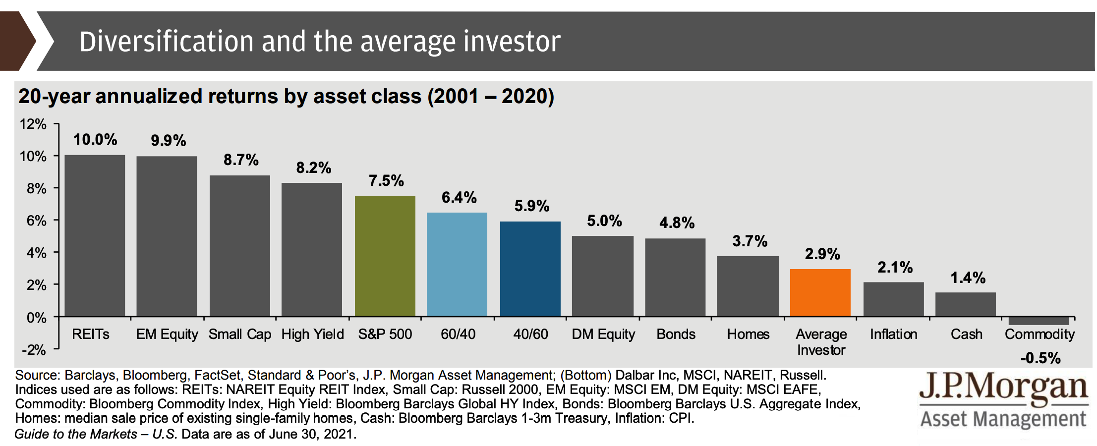
Next, a chart illustrating that the portfolio of the "average investor" tends to perform significantly less well than the S&P 500 — and even less well than an all-bond portfolio.
Click Chart to Enlarge
This unfortunate underperformance is likely due to "buying high and selling low" — i.e., buying when the market has rallied and prices are high, then selling during a correction (or bear market) when prices are lower.
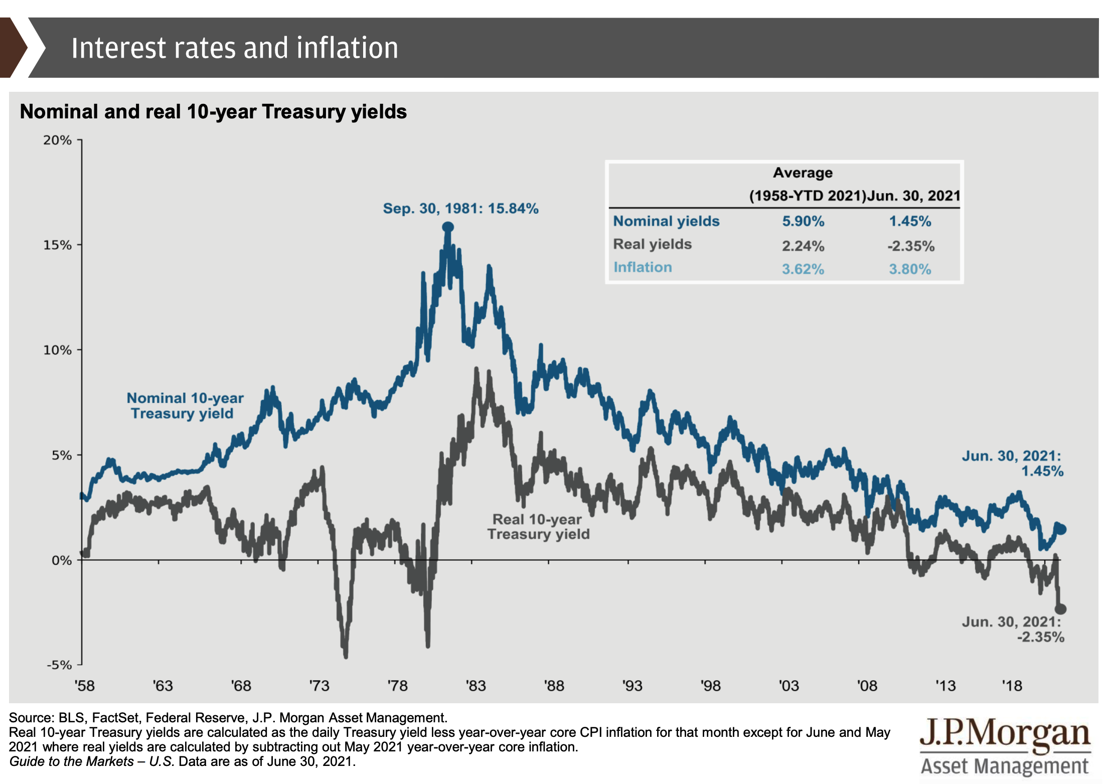
The next graph serves to illustrate the interest-rate dynamic Mark wrote about recently in Inflation Still Coming in Hot. He noted that inflation makes the government’s massive debt more affordable because it effectively drives down the rate of interest the government must pay.
Click Graph to Enlarge
Note that as of June 30, 2021, the "real" (inflation-adjusted) yield on a new 10-year Treasury Note, issued by the United States government, stood at –2.35%.
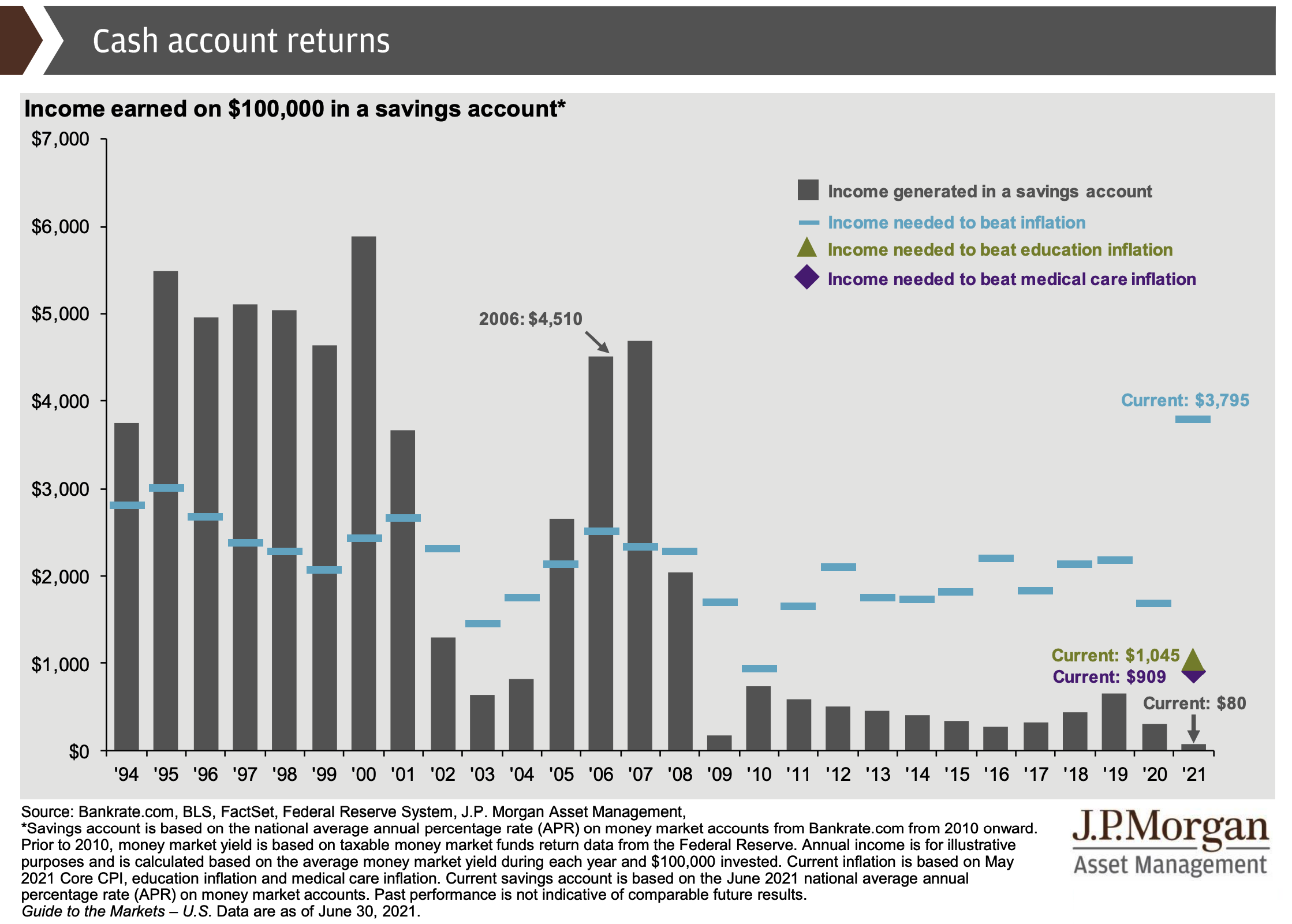
Here’s an unhappy graph for savers. It illustrates the minuscule returns that one earns these days in a savings account.
Click Graph to Enlarge
You’ll notice how it used to be relatively easy to stay ahead of inflation by putting money in savings. That has not been the case for more than a decade.
Finally, here are three visuals that reflect what Matt wrote about recently in A New Generation of Investors. Look first at the top graph on the right. Notice the huge increase in investment flows coming from people ages 18-25.
The bottom graph at right shows that a lot of money has been coming into the market from people who don’t have much money, i.e., people in the $0-20K income group. (Much of that likely was "stimulus" payouts from Uncle Sam.)
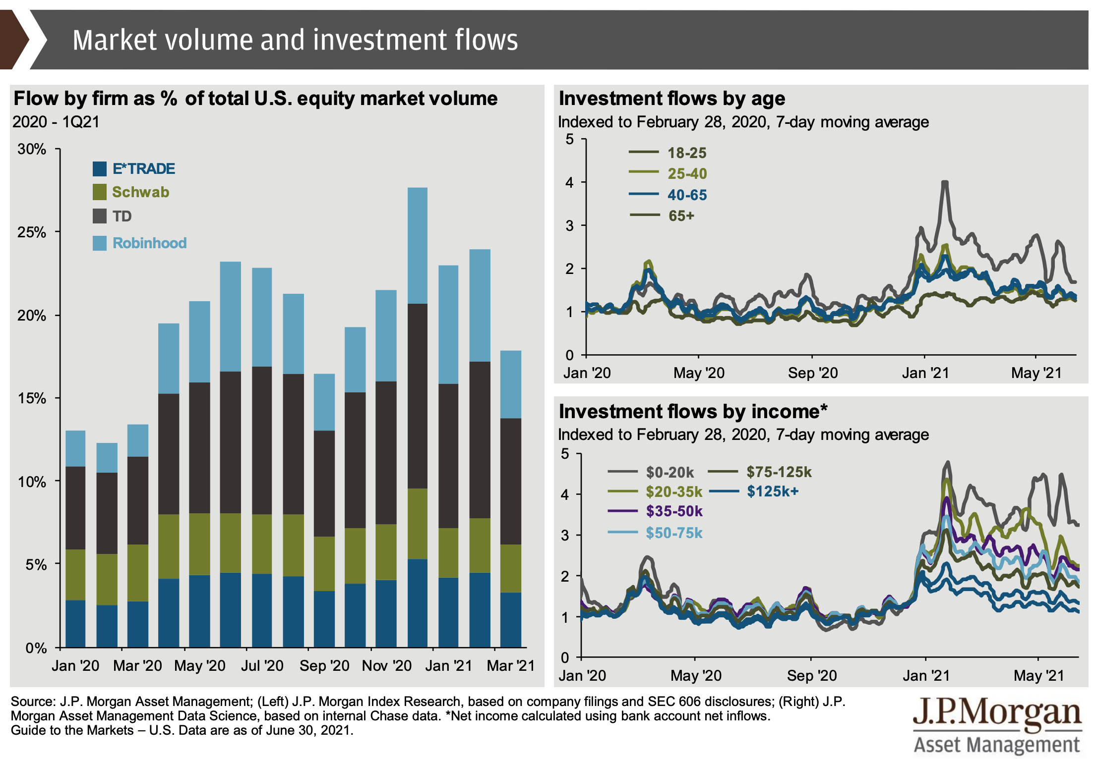
Click Graphic to Enlarge
Also note the graph on the left showing large gains in market share by the app-based brokerage firm Robinhood, which has done an effective job of appealing to younger investors.
The full J.P. Morgan’s "Guide to the Markets" report has about 75 more charts and graphs. You can see the entire 83-page report here.