

SMI has always believed that helping investors form realistic expectations is important to their long-term success. That’s because investing success is primarily driven by controlling one’s emotions, and knowing what’s reasonable to expect helps immensely in that regard.
For example, if you know that the stock market experiences a 10% correction roughly every 18 months, you’re much less likely to freak out and sell stocks when they’ve suddenly dropped 12% for the first time in two years. If you don’t know that historical pattern, you’re more likely to make an emotional mistake in that scenario. Make enough of those emotional mistakes and they start to seriously compromise your long-term returns.
We’ve talked about the difference between stock market corrections and bear markets before, but I saw a chart today that really helps illustrate some key points. Before diving into that chart though, let’s quickly review some basics about market declines.
A stock market pullback is generally defined as a decline of 5%-10% from a previous high. I don’t have any exact numbers at my fingertips in terms of the frequency of pullbacks, but they happen regularly — multiple times each year.
Corrections are drops of at least 10% from a prior market high. This is when things start to feel serious and investors start getting nervous. You’ll see different stats thrown around regarding corrections (which is why I often say things like "depending on which data series you use" when discussing them), but here are a few key points in terms of historical frequency.
If you go all the way back to the 1920s when the S&P 500 data series begins, you get an average of a correction happening every 11 months. But that’s skewed by the large number of corrections around the Depression. If you look at just the post-WWII period, corrections have occurred every 16-17 months. So expect a correction every year-and-a-half or so. It had been two years (Feb 2016) since our last correction when this February’s correction came along, so you can see we were due from a historical standpoint. Again, knowing that helps make it feel more normal and less scary.
In terms of severity and length, corrections vary widely. Some are shallow and short, others drag out many weeks and are quite deep. Bespoke Investment Group has calculated that the median historical correction depth for the S&P 500 has been -16.4%. Two things about that number though: First, that’s the median, not the average, meaning if you lined up all the U.S. market drops of more than 10% since 1928, the one exactly in the middle would be -16.4%. And second, that figure includes all of the bear markets too, so if you were just looking at declines of between -10% and -20%, that number would be lower.
Bear markets generally are defined as drops of more than 20% from a prior high (although some people add criteria regarding the speed/length of the decline). It’s difficult to say exactly how often they occur because people generally tend to lump multiple "technical" bear markets together as one. For example, between 2000-2002, there were technically two separate 20%+ drops, but almost everyone considers 2000-2002 to be one single bear market, not two.
Based on that less-technical definition (which combines some of the smaller bears into fewer bigger ones), most people would agree there have been at least eight bear markets since the 1920s (while some would argue, with reasonable justification, for a higher number). Given that, it’s reasonable to expect a true bear market roughly once per decade. Although as we saw last decade, there’s nothing magic about that, as we got two (2000 and 2008).
Enough with the definitions, on to the chart. It comes from a note written by Jeffrey Kleintop, the chief global investment strategist at Charles Schwab & Co., showing the behavior of the MSCI World stock index during downturns of various types since 1979.
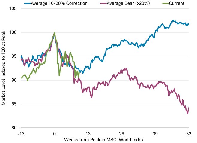
Here’s how to read the chart. The "0" point on the bottom (X) axis represents the average market peak. The far left of the chart (from -13 to 0) shows what the market typically does in the 13 weeks leading up to the market peak, and then the rest of the chart (from 0 to 52) shows typical market behavior in the 52 weeks following the typical peak.
The blue line shows what the global stock market has done, on average, during corrections. The purple line shows the average bear market. The green line shows the path the current market has taken leading up to, and since, the late-January 2018 market high.
Ignore the green (current) line for a moment. What I find so interesting about this chart is the way the blue and purple lines trace a virtually identical path in the 13 weeks prior to a top and the 10 or so weeks following it. In other words, corrections and bear markets look exactly the same for roughly the first 10 weeks or so following a market peak. There’s no way, based on the market’s action at least, to distinguish between them at that point. The takeaway here is that for the first 2-3 months following a market peak, anyone saying the decline is "just a correction" or "the beginning of a bear market" is really just guessing. It’s simply too soon to tell.
This historical pattern has significant implications for the way we design any protective elements in our investing strategies. Based on this information, you certainly don’t want to overreact to anything that happens within the first few months of a market decline, because up to that point it’s just as likely to be a routine, short-lived correction as the beginning of a new bear market. You can afford to — and in fact need to — be very patient letting the market process unfold, lest you jump the gun and start playing defense just as the market is getting ready to resume its march higher (blue line).
Thankfully, the rest of the chart confirms that there’s no rush to "make a call" as to whether a bear market is underway or not. Even after the blue and purple lines diverge at around the 10-week mark, notice what the purple (bear-market average) line does next: after declining a bit further toward the -15% level (shown as 85 on the left axis), there’s typically a bounce back higher over the subsequent 2-3 months (between weeks 13-26 on the chart). At that point, the average bear market is already half a year old, yet on average is down less than -15% from the prior peak. It takes nearly another 6 months to finally plunge below the -15% level and start approaching the -20% definition of a genuine bear market.
Now, in fairness, this chart is looking at weekly averages. Sometimes the market will plunge down lower during a given week and then bounce back up, so it’s certainly possible that while the average bear market at 13 weeks is down only roughly -13% as the chart shows, in any given example the market may have briefly plunged deeper — perhaps all the way to -20% or more. Plus these data extend back only to 1979, so it’s not as if there’s a huge number of examples from which to draw conclusions.
Still, the main point the chart illustrates is an important one — that bear markets are typically slow to develop, which gives us a lot of time as investors to evaluate and respond before taking any action. (That’s a stark contrast to the way bear markets end, which tends to be a much sharper "V" shaped selling climax that quickly turns into the strong upturn of the next bull market.)
We’ve made this point about the gradual nature of new bear markets many times before. It’s encouraging to see the same conclusion reached using this different data set (world stocks, including the U.S.) than what we normally focus on (U.S. stocks alone).
All of this explains why the defensive measures in SMI’s strategies are slow moving and intentionally don’t kick in quickly. We want to be as sure as possible that we’re past any routine correction scenarios before making adjustments to our portfolio holdings. Thankfully, this chart indicates that’s the right way to set things up, as there’s normally plenty of time to wait patiently and make sure.
We hope seeing this in black and white (or blue and purple!) will help your emotional state during the relatively common pullbacks and corrections the market experiences. If you know that bear markets typically don’t start with a bang, and that you can afford to patiently wait for the market to either recover or signal that something more serious is at hand, you’ll be more likely to stick with your long-term plan. That’s the recipe for long-term success. And if you’re following the SMI strategies that include some sort of defensive protocol within them (Dynamic Asset Allocation or Fund Upgrading), you can simply rely on the strategy itself to evaluate when the market is saying it has moved beyond something routine and into a stage when protective action is warranted.